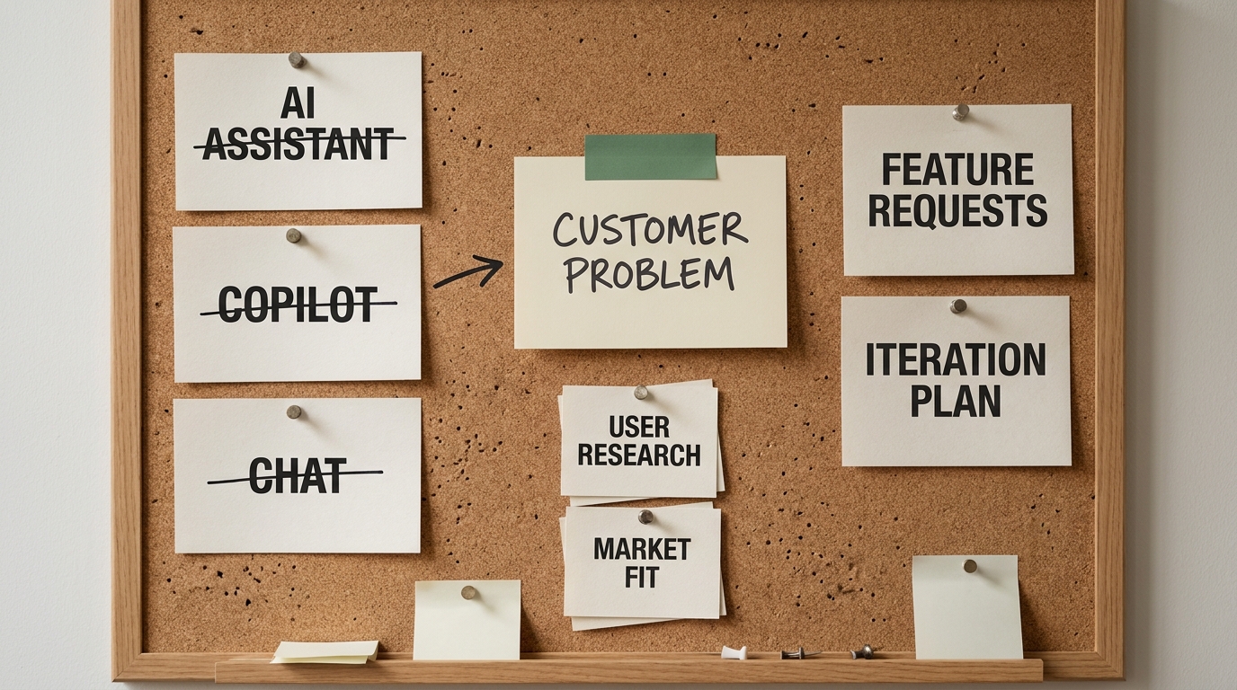

The people who roll AI out usually build the dashboard too, so the dashboard ends up measuring the rollout. Licenses provisioned, seats active, prompts sent this month. Every number climbs, and not one of them tells a board what the spending produced. That is not a reporting oversight. It is a category error. Usage and value are different variables, and a dashboard can glow entirely green while the enterprise gets nothing back. A board does not fund rollout. It funds outcomes, and it will keep asking for outcomes until someone puts them on a page.
The five categories below are that page. They cover the value metrics a board-grade AI dashboard tracks, the activity metrics each one replaces, and how to measure them without faking a precision you do not have. It is written so a CEO or CFO can forward it to a COO or CIO with a single instruction: build me this.
The dashboard problem: activity metrics answer the wrong question
There are two families of AI metrics, and boards routinely get shown the wrong one. Activity metrics count effort and access, things like seats licensed, users active, prompts sent, tools deployed, training completed. Value metrics count consequence: work that changed, time removed, quality improved, money moved, risk contained. Activity is an input. Value is a result. A dashboard made entirely of activity metrics can look excellent while the enterprise gets nothing back, because usage and value are not the same variable.
Activity metrics are seductive for a reason. They are easy to collect, they almost always trend up, and rising usage feels like progress. A vendor console hands you seat counts and prompt volumes automatically, so they fill a dashboard with no effort at all. The trouble is that high usage can sit right next to zero effect on the P&L. A thousand people using a chat assistant to write emails faster is a thousand active seats and, quite possibly, no measurable business outcome . The number went up. Nothing else did.
The wider evidence backs up how common this trap is. McKinsey's State of AI research (2025) has repeatedly found that a large majority of organizations now use AI in at least one function, while a much smaller share can point to enterprise-level financial impact from it. Deloitte's State of AI in the Enterprise (2026) describes the same tension as a paradox of rising investment and elusive returns: spend keeps climbing, and the returns stay hard to pin down. MIT Sloan's work on adoption adds a further nuance, that where AI lands, and who actually changes how they work, matters more than headline usage. Read together, these are not arguments against AI. They are arguments against measuring AI by activity, because activity is exactly the thing that has scaled while value has lagged.
So the first move is not to add metrics. It is to stop reporting the vanity ones as if they were results, and to be explicit with the board about which is which.
What value means to a board, and why it differs from IT's definition
Ask an IT leader whether an AI program is succeeding and you will often hear about utilization. Adoption is high, the tool is sticky, support tickets are down. Those are legitimate operational signals. They are not what a board means by value. A board evaluates any investment through three lenses, and AI is not exempt from any of them.
- Profit and loss. Did this change revenue, cost, or margin in a way you can show, even as a range?
- Risk. Did we take on new exposure, and is it controlled, or did we quietly create a model-risk and compliance problem we will hear about later?
- Durability. Is the gain repeatable and defensible, or is it a one-off that evaporates when a vendor changes a price or a model?
Utilization answers none of those directly. That is why a dashboard built for IT translates poorly to the boardroom. It is optimized to prove the rollout happened, not to prove the investment paid. The fix is to report AI in the board's own language. Everything that follows maps to those three lenses, so the CEO forwarding this can tell a COO exactly what to build and, just as importantly, why the board will accept it.
If your current pack cannot yet answer the profit, risk, and durability questions, that is the signal to get an outside read before the next cycle. A short diagnostic like an AI Readiness Snapshot exists precisely to map where AI will have measurable impact first, so the dashboard you build measures the things that will actually move.
The five metrics a board-grade AI dashboard tracks
Here is the spine of the whole approach. Five categories, each one a value metric that retires a specific activity metric. Treat this table as the reference the rest of the article expands.

| Value category | Retire this activity metric | Report this instead | How to measure it |
|---|---|---|---|
| Workflows changed | Licenses provisioned, seats active | Count of business processes redesigned around AI and in production | Inventory of named workflows with a before and after design, gated by "is it live" |
| Hours removed | Prompts sent, sessions logged | Measured time taken out of those workflows | Baseline the task time before, remeasure after, net out new AI-related steps |
| Error rate reduced | Model accuracy in a demo | Quality or defect rate change in the live workflow | Sampled quality review of real output, before versus after, same rubric |
| Revenue or process impact | Tool spend, cost of licenses | Dollar or throughput consequence, shown as a range | Attribute conservatively to changed workflows, disclose the baseline and assumptions |
| Risks controlled | Training courses completed | Governance, model, security, and compliance posture on the changed workflows | Coverage checklist: human-in-the-loop, monitoring, data controls, review cadence |
The pattern is deliberate. Each row swaps something that trends up automatically for something you have to earn. That is the point. A metric you cannot game upward is a metric a board can trust. The next five sections take each row in turn.
Workflows changed: counting redesign, not seats
The foundational value metric is the number of real business processes that have been redesigned around AI and are actually running in production. Not seats bought. Not pilots underway. Workflows that used to happen one way and now happen a different, AI-shaped way for real customers or real internal operations.
To count this honestly, define a "changed workflow" tightly enough that it is not gameable. A workflow qualifies when three things are true. The process is named and owned by a specific function. Its design genuinely differs from the pre-AI version , rather than a tool bolted onto the old steps. And it is live, serving real volume, not a sandbox demonstration. Anything that fails one of those tests is a pilot, and pilots belong in a separate line so the board can see the ratio of production to experiment.
Consider a clearly hypothetical example to make it concrete. A claims intake team used to have humans read every incoming document, key the fields, and route the file. They redesign the workflow so AI extracts and pre-populates the fields, humans review the exceptions, and routing is automatic. That is one changed workflow: named, redesigned, and in production. It counts once, regardless of how many people hold a license for the tool that powers it. Report the count, the function each belongs to, and the production-to-pilot ratio. A board reading "nine workflows redesigned, six in production, three in pilot" learns more than it ever would from ten thousand active seats.
Hours removed and error rate reduced: the productivity pair
These two travel together because they describe the same changed workflow from two angles: how much faster it runs, and how much better. Report them as a pair for each workflow, never as a company-wide average that hides the variance.
Hours removed is the measured time taken out of a redesigned workflow. The discipline is in the baseline. You have to know how long the task took before, ideally from real records rather than a recollection, then remeasure after the change and net out any new AI-related steps such as prompt writing or exception handling. The honest figure is time removed after those additions, not the gross saving that ignores them. And be careful about what "time saved" actually means. Hours only become value when they convert to something the business can bank: redeployed capacity, higher throughput, or a headcount decision the organization actually makes. Time that saves twenty minutes across a task nobody was waiting on is real to the individual and invisible to the P&L. Say which kind you are reporting.
Error rate reduced is the quality side of the same workflow. Sample the live output before and after using the same rubric, and report the change in defects, rework, or accuracy. Quality matters to a board for a reason beyond customer experience. An AI change that makes work faster but worse can destroy more value than it creates, and the speed metric on its own would hide that. Reporting the pair keeps the program honest. A workflow that removed thirty percent of the hours and cut the error rate is a win. One that removed the hours and raised the error rate is a problem wearing a green light.
Revenue and process impact: connecting AI to the P&L without faking precision
This is the metric the board most wants and the one most likely to be reported dishonestly. The temptation is a single confident dollar figure. Resist it. The credible version connects changed workflows to the P&L as a range, with the baseline and assumptions disclosed, and it distinguishes direct from indirect impact.

Direct impact is money you can trace to the changed workflow in few hops: cost removed because a process needs fewer hours, revenue gained because a cycle time shortened and more deals closed. Indirect impact is real but softer, things like better customer experience, faster onboarding, reduced risk of an expensive error. Both belong on the dashboard, but they belong in different columns, labeled, so nobody mistakes an estimate for a receipt.
The reason to be this disciplined is the same paradox Deloitte (2026) named. Returns look elusive partly because they have been overclaimed, and boards have learned to distrust a number that arrives without a baseline. Show the range. Show what it is anchored to. Show what you assumed. A CFO will respect "we estimate three to five million in annualized cost removed, based on measured hours in six production workflows, assuming redeployed capacity is realized in two of them" far more than a lonely, unqualified "five million." The first can be defended in an audit committee. The second cannot survive the first hard question.
Once a board can see impact framed this honestly, the next question is usually operational: how do we build and sustain the measurement itself. That is the natural point to bring in a structured engagement such as an AI Transformation Discovery sprint, which turns the taxonomy on this page into a concrete roadmap for the workflows worth instrumenting first.
Risks controlled: the metric boards ask about that dashboards forget
Almost every ROI-focused AI dashboard forgets the metric a board is contractually obliged to care about, which is risk. Directors have duties around oversight, and "we moved fast and did not track the exposure" is not a position any board wants to defend. Risk controlled is not a footnote on a value dashboard. It is a peer of financial impact, and it should sit next to the revenue line, not in an appendix.
Make it trackable rather than rhetorical. For each changed workflow, report coverage across a short, concrete checklist.
- Human-in-the-loop coverage. Which decisions have a human review step, and does that coverage match the stakes of the workflow?
- Monitoring. Is the model's output being watched for drift and failure in production, or was it checked once at launch and left alone?
- Data and privacy controls. What data does the workflow touch, and are access and retention controls in place and evidenced?
- Compliance and model risk. Is the workflow inside the relevant regulatory and internal model-risk framework, with an owner named?
- Review cadence. How often is each of the above re-examined, and when was the last review?
Responsible-AI tooling exists to help produce some of these signals, and you can adopt it without turning the board report into a vendor pitch . The board does not need the tool's name. It needs to see that every workflow generating value is also generating controlled, monitored, owned risk, and to know which workflows are not yet covered so it can weigh them. A value metric without a paired risk metric is an invitation for the program to outrun its governance.
Attribution: proving it was the AI
Every number on this dashboard invites the same challenge: how do you know the AI caused it, and not a seasonal swing, a pricing change, or a good quarter that would have happened anyway? A board-grade dashboard answers that challenge before it is asked, because attribution is where credibility is won or lost.
Three practices carry most of the weight. First, baselines. You cannot claim a change you never measured the starting point for, so instrument the before, even when it is inconvenient, because a result without a baseline is just an assertion. Second, comparison. Where you can, hold something constant: a control team, a control region, or a prior period matched for seasonality, so the AI-changed workflow has something honest to be measured against. Third, honest labeling. Mark every figure as measured, estimated, or modeled, and never let an estimate graduate to a fact because it got repeated in three decks.
The contrast the board is really testing for is simple. "What good looks like" is a claimed impact with a baseline, a comparison, and a clear label on how confident you are. "What a board will reject" is a large round number with no baseline, no comparison, and no acknowledgment of uncertainty. The irony is that the honest version, with its ranges and caveats, is the more persuasive one in a room full of people whose job is to find the hole in the story.
What to put in front of the board, and how often
A board does not want the operational dashboard. It wants a one-page derivative of it, on a predictable cadence, that answers the value question at a glance. Quarterly is the right rhythm for most organizations. It is frequent enough to catch drift, and spaced enough that real outcomes have time to show up.

The one page has five things on it, and nothing else.
- The five value categories, each with a trend arrow against the prior quarter, so movement is visible without a table.
- Workflows changed, shown as production versus pilot, so the board sees how much is real.
- One range-based financial figure, with its baseline and confidence label attached, never a bare number.
- One risk status, summarizing coverage across the changed workflows and flagging any generating value without controls.
- One decision the board is being asked to make, whether that is fund the next set of workflows, pause one, or change course.
For the COO or CIO who has to build this, the assembly checklist is short. Maintain the workflow inventory with its production-to-pilot status . Baseline every workflow before you change it. Report hours and error rate as a pair. Convert impact to a disclosed range, not a point. Track the risk checklist per workflow. Then compress all of it to the one page above for the quarterly pack. If maintaining that measurement engine outstrips the team you have, an embedded Fractional Agentic Team can own the instrumentation while your people own the workflows.
Common mistakes that make an AI dashboard useless
Most failed AI dashboards fail in a handful of predictable ways. Naming them is the fastest way to avoid them.
- Vanity-metric reporting. Leading with seats and prompts because they are easy and they trend up. The board learns nothing and, worse, learns to distrust the whole pack.
- Single-number ROI theater. One confident dollar figure with no baseline, no range, and no label. It impresses for one meeting and collapses under the first serious question.
- Ignoring risk. Reporting value with no paired governance metric, so the program looks healthier than it is and the exposure surfaces later as a surprise.
- No baseline. Claiming improvement without ever measuring the before, which turns every result into an unfalsifiable assertion.
- Tool-first instead of workflow-first. Organizing the dashboard around which tools are deployed rather than which workflows changed, which measures the rollout again and misses the point entirely.
Every one of these is a version of the same original sin: measuring what is easy to count instead of what the board actually needs to know . The five value categories exist to force the harder, more useful count.
Key takeaways
- Activity metrics (seats, prompts, licenses) measure rollout, not value. A board funds outcomes, so a board-grade dashboard reports outcomes.
- Track five value categories: workflows changed, hours removed, error rate reduced, revenue or process impact, and risks controlled. Each one retires a specific vanity metric.
- Report financial impact as a disclosed range with its baseline and assumptions, never as a single unqualified number. Ranges survive an audit committee. Round numbers do not.
- Make risk a peer of financial impact. Every workflow generating value should also show controlled, monitored, owned governance.
- Compress it to one quarterly page: five categories with trend arrows, production-versus-pilot workflow count, one range-based figure, one risk status, and one decision to make.
The payoff is a board conversation you can win. When the director looks up and asks what the AI money bought, the answer is on the page, in the board's own language, with the honesty that makes it believable. If you want a fast read on where your organization would get measurable AI value first, start with an AI Readiness Snapshot and build the dashboard around what it finds.